Indy 500
The Indianapolis 500, visualized. An interactive history of every winner since 1911, the closest finishes, and the speeds and records behind them.
Mission
The Indy 500 has more than a century of history behind it, but most of that history sits in record books and long tables. I wanted to turn it into something you could explore instead, a piece that treats the numbers like the spectacle they actually describe, and to stretch my own practice beyond Tableau by designing and building something fully custom, end to end.
Background
I built this one for myself. The Indy 500 has more than a century of history behind it, but most of that history sits in record books and long tables. Winners going back to 1911, victory margins measured in fractions of a second, a four-win club you can count on one hand. It's rich material, and almost none of it is any fun to read in a spreadsheet. I wanted to turn it into something you could explore instead, a piece that treats the numbers like the spectacle they actually describe. It was also a way to stretch my own practice. Most of my work lives in Tableau, so this was a chance to design and build something fully custom from the ground up, with complete control over every layout, color and interaction.
My approach
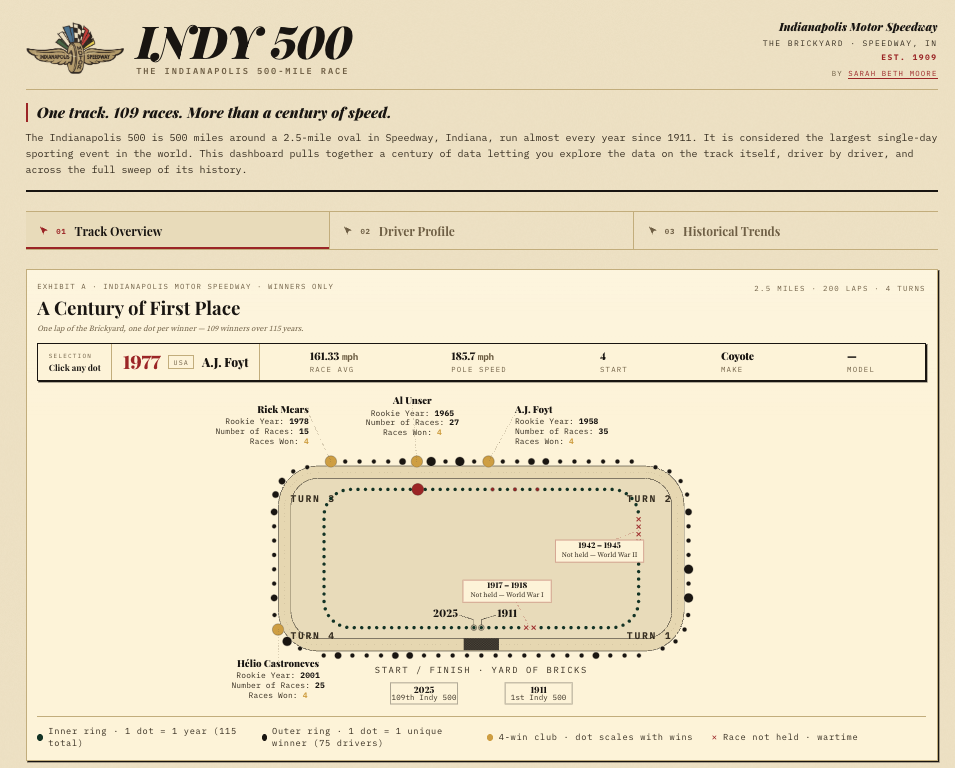
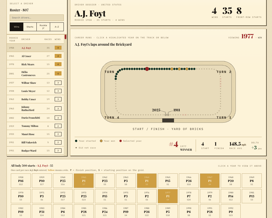
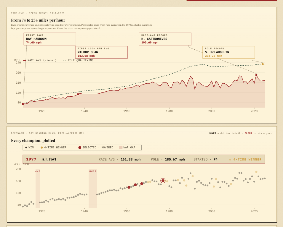
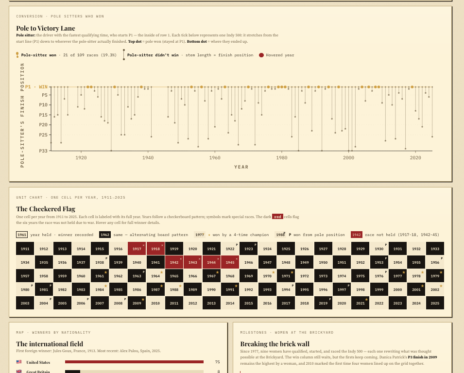
I structured it as three connected views. Track Overview places every winner on the speedway itself, so you can click any driver and read their story without leaving the page. Driver Profile pulls a single racer into focus, with their full set of Indy 500 starts laid out on one timeline. Historical Trends steps back to the long view, charting how the race has changed across its 109 runnings. The look came out of the subject. I landed on a retro newsprint aesthetic: an ink-black, mint and red palette under a "newspaper slab" masthead, with a full-bleed checkered strip and the official Wing & Wheel mark. I tried a few other directions along the way, including a modern F1-telemetry treatment and an all-vintage brown, and let them go. The newspaper approach held the history and the drama at the same time. Most of the real work was in the small decisions. I gave the whole dashboard one consistent color logic, wins always red and ranks always mint, so the eye learns the system once and then reads it everywhere. I added superlative cards (a Fastest Five and a Tightest Five), a Four-Win Club, and a "Speedway by the numbers" row to give the data a bit of swagger, plus a yellow accent to break up the white wherever it started to feel heavy.
How it was used
The finished piece is a single HTML file that opens in any browser and runs fully offline. No server, no dependencies, nothing to install. I keep it as a standalone export and also brought a copy into Canva as an editable design, so it can travel as a portfolio piece as easily as it works as a dashboard.
Feedback & testimonials
Working inside hard constraints, one file, one palette, one consistent set of rules, made the piece stronger rather than smaller. The parts I'm happiest with are the ones I nearly cut: the superlative framing that turns a data table into something you actually want to click, and the decision to commit to a single color language and then trust it. It was a good reminder that a strong visualization isn't about showing everything; it's about giving someone a reason to look. And it was exactly the push I wanted out of my Tableau comfort zone, a project I designed and built end to end.