Heron Atlas
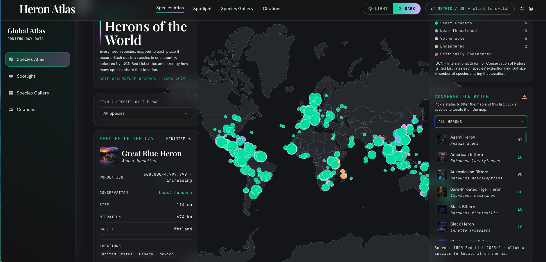
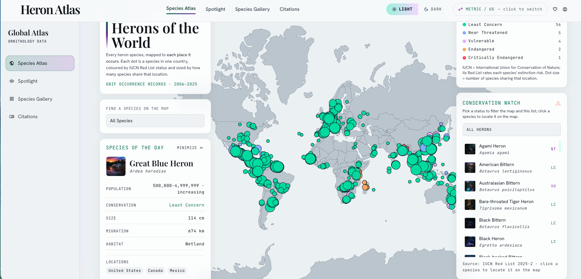
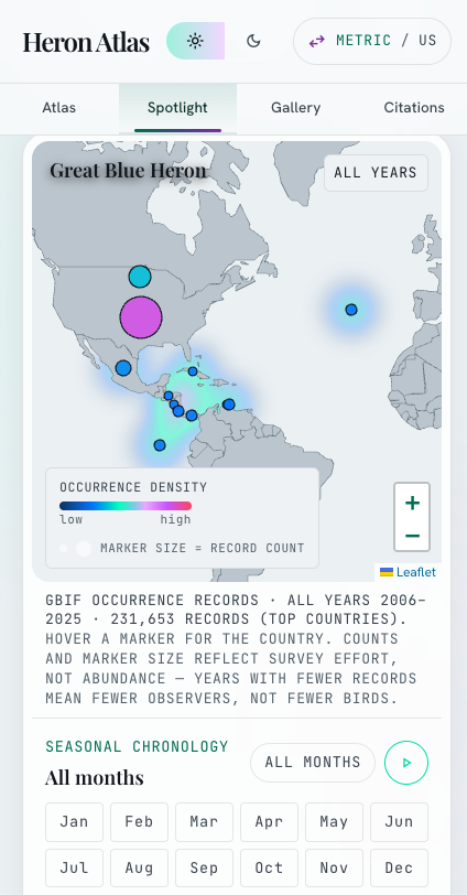
An interactive atlas of all living heron species that maps where each one lives, how threatened it is, and which ones migrate. Species ranges come from GBIF occurrence records, conservation status from the IUCN Red List, and body size and diet from the AVONET and EltonTraits databases.

Mission
Herons are my favorite birds, and I wanted to understand them properly. So I launched a research study into the whole family, gathering everything the open science record holds on all 68 species. What started as personal curiosity became an ambitious AI project: I visualized the data I found and turned it into an interactive dashboard and atlas of the world's herons, rigorous enough for researchers, immersive enough to pull anyone in, and built to show not only what we know about these birds but exactly where our knowledge of them runs out.
Background
Wildlife dashboards are full of numbers that look authoritative and come from nowhere: "migration velocity," "satellite feeds," population counters ticking upward in real time. I wanted the opposite. An atlas of all 68 extant heron species built only from open, citable science, where the things we don't know about the rarer, less-studied birds are shown as absences instead of being invented. That restraint became the whole point of the project.
My approach
I built the dataset in layers, all joined on scientific name under IOC taxonomy, and sourced every field from open science: species positions from ten million GBIF occurrence records (using medians to resist stray vagrants), status and population from the IUCN Red List, size and diet from the AVONET and EltonTraits databases. Where a source was wrong I dropped it. A database claiming the Goliath Heron weighs 109 grams didn't make the cut. When the ideal migration data was unreachable, I approximated the arcs from occurrence records and labeled them plainly as approximations, drawing one only for the 39 species the data could actually support. Then I brought the data to life through a deliberate AI toolchain. I generated the visual direction and the cinematic species portraits in Google Stitch, developed it into a full "Lumina Atlas" design system with Claude Design, and built the interactive front end with Lovable and Claude Code. The whole thing is version-controlled and hosted free and public on GitHub Pages as a single self-contained page.
How it was used
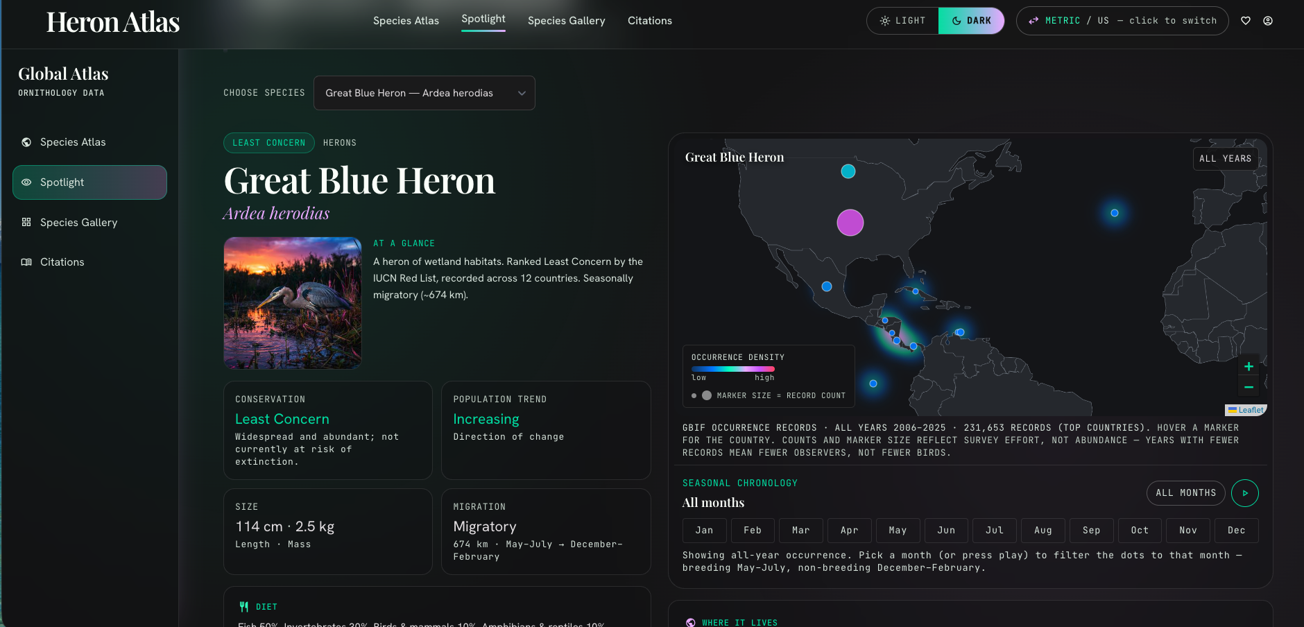
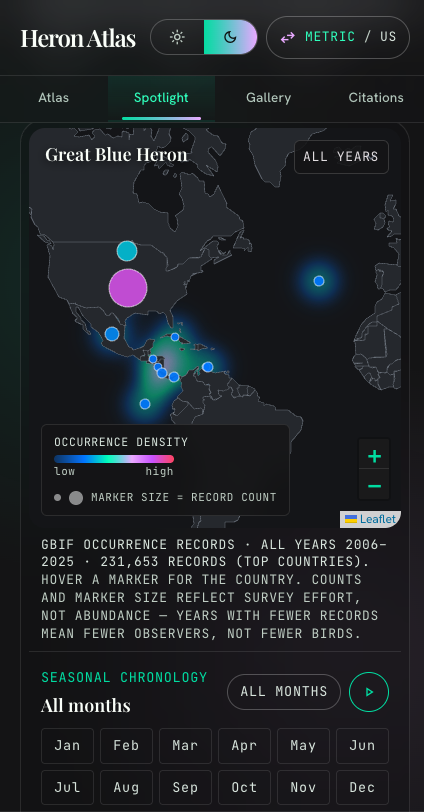
It lives as a public, interactive atlas: a filterable world map, per-species profiles, a full gallery, and a citations page crediting every source behind the figures.
Feedback & testimonials
The biggest lesson was that restraint is a feature. Leaving a field blank when the data wasn't there made the whole atlas more trustworthy, not less. I also learned to verify everything, because sources can be confidently wrong (a heron as tall as a child listed at 109 grams taught me that quickly). And the gaps turned out to be the most honest part of the story: the 29 species with no mappable migration say something real about how unevenly we study the natural world. On the technical side, working across several AI tools taught me how to keep a single source of truth clean as it moved between them.